full of details-appreciation of Japanese food packaging
Simple and full of details-appreciation of various Japanese food packaging ideas
Japanese aesthetics | Packaging design collection
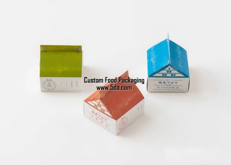
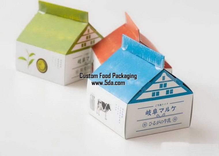

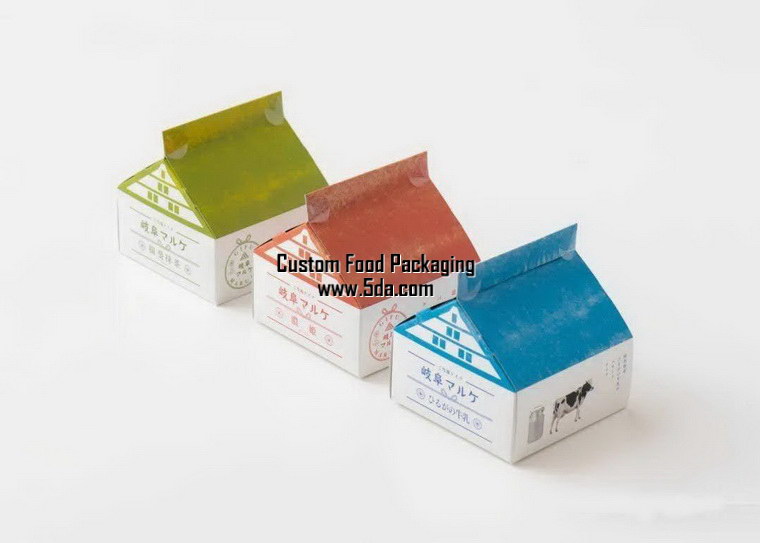

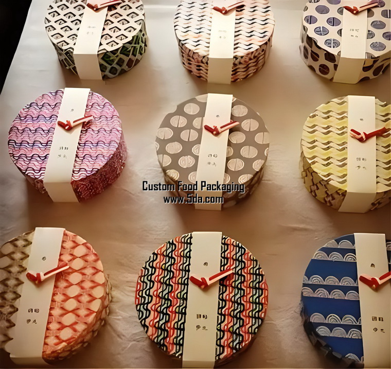
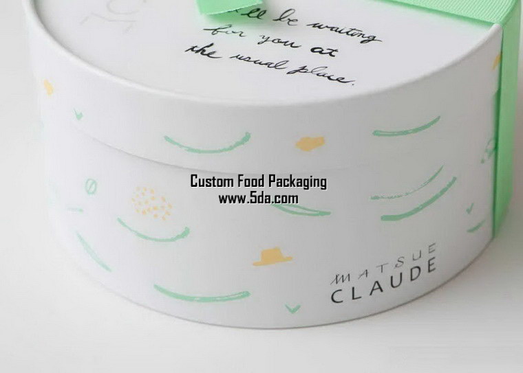
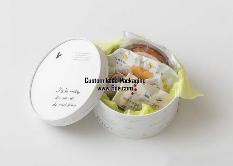
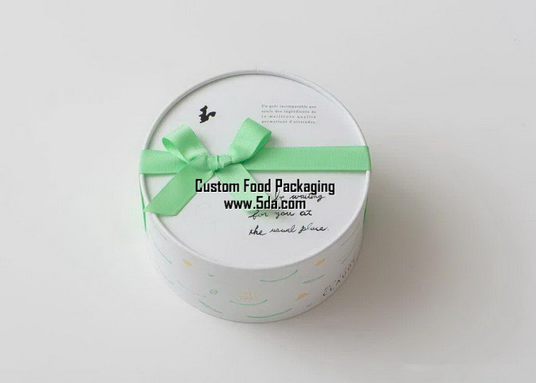
Fresh and cute food gift box ideas
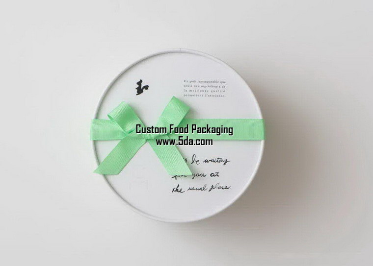
The detail processing is also reasonable
The outer packaging and pouch packaging are relatively delicate.


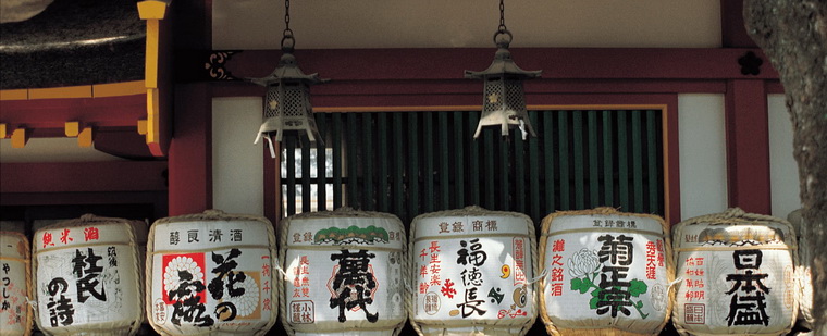
Festive packaging creative design with traditional color matching


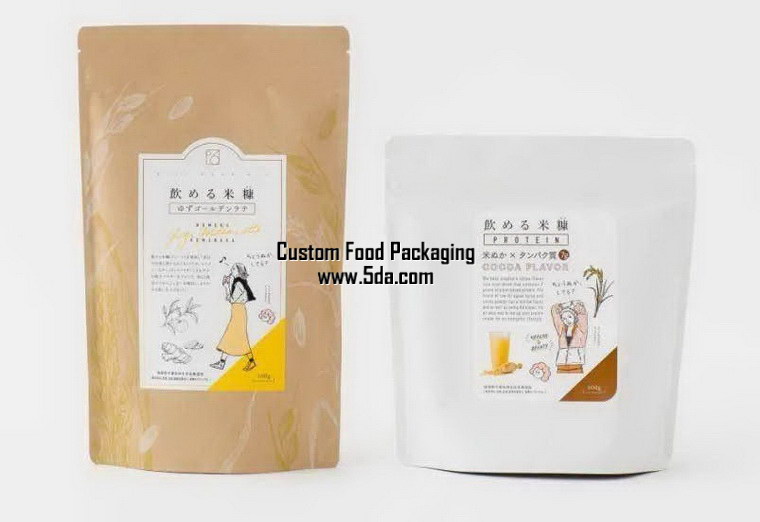
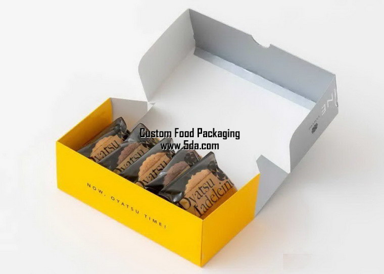
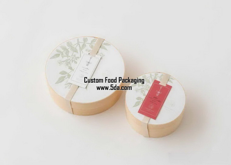

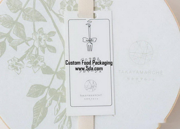
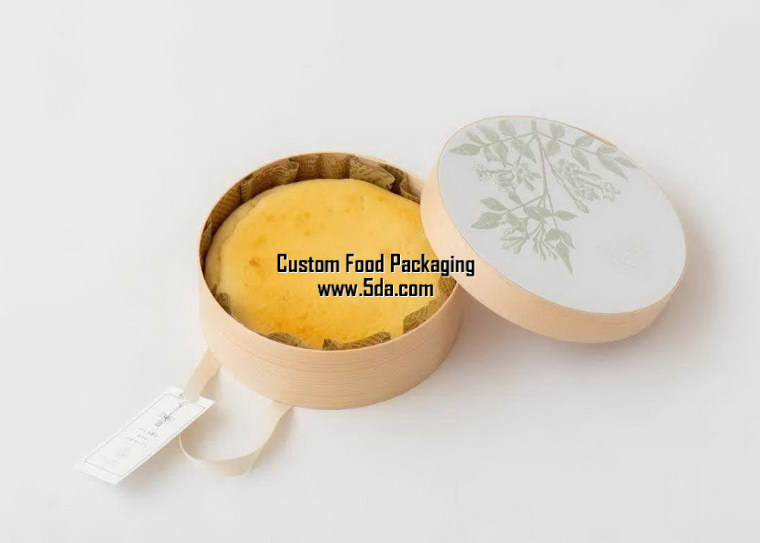
Exquisite and beautiful packaging ideas for honey products

Traditional handmade packaging
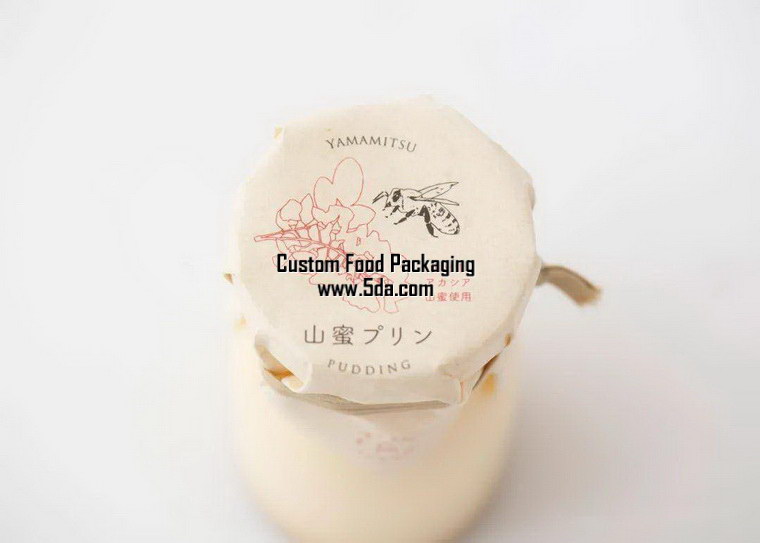
The bottle mouth paper is made of environmentally friendly materials
The knotting/sealing method also has a strong traditional feel
Looks very handmade
With a unique handmade warmth/natural feel
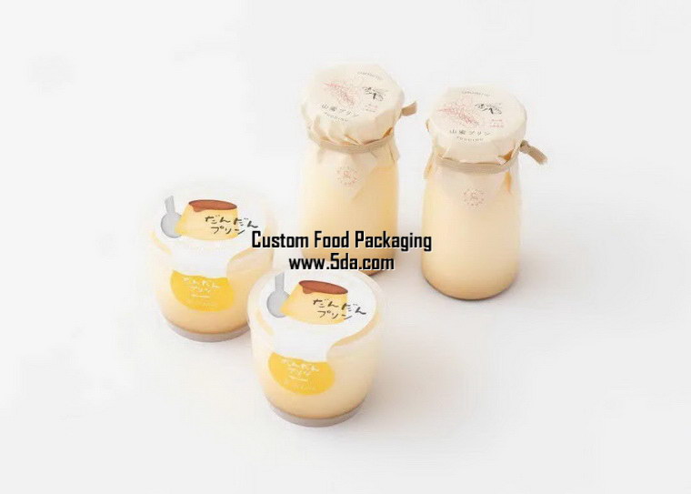

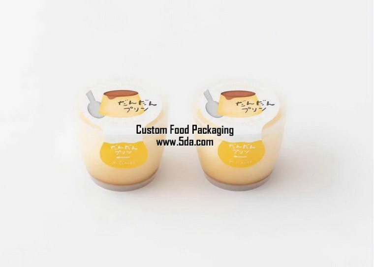
Fresh + elegant hand-painted handbag design

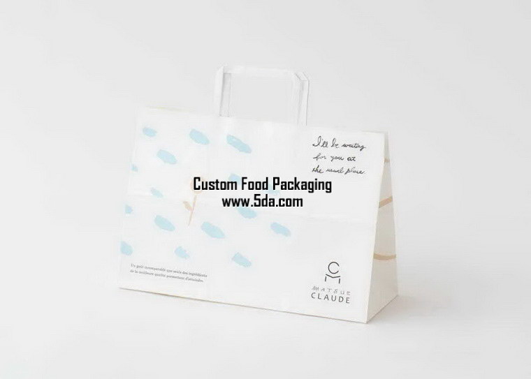
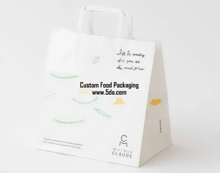
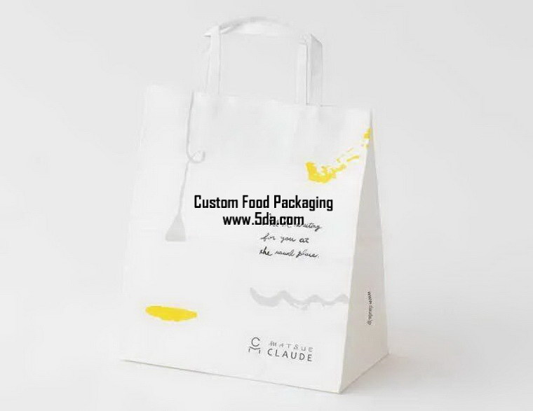
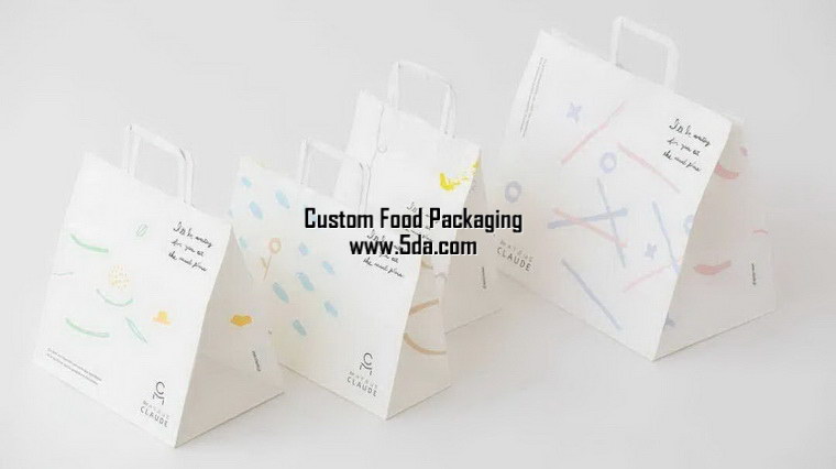
There are no strong impact colors like those in Europe and America.
Warm and natural colors
Elegant and fashionable visual sense
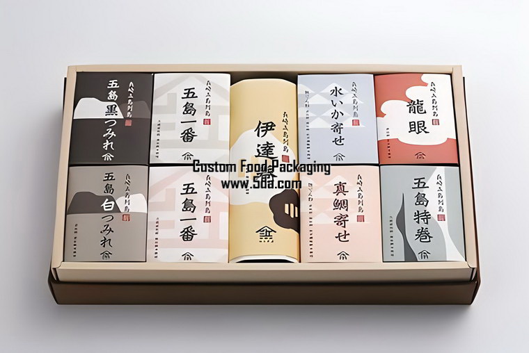
The sense of handwritten fonts also reveals good and thoughtful design everywhere.


Baking/dessert packaging design series


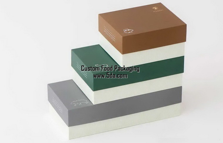
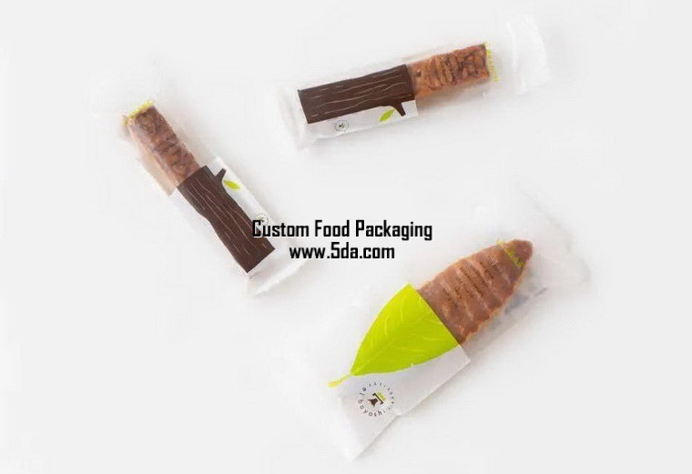

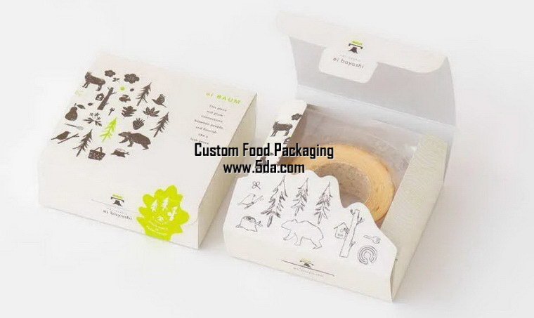
There is no excessive packaging and some packaging materials just feel right.
It doesn't seem complicated and the packaging format is also quite intriguing.


Japanese packaging design is liked by many Chinese people
In today's era where efficiency is important/everything is about money
The era of rampant commercialization
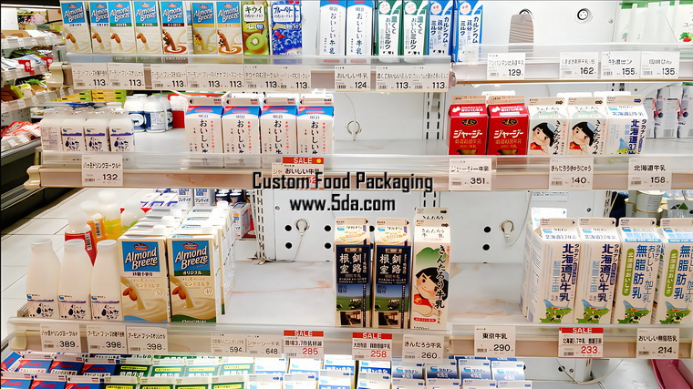
The visual impact of Japanese packaging sometimes fails to dominate
In product terminals (supermarket shelves/web pages) and communication
It's reflected
This requires long-lasting brand communication and staying power.
Look at companies and brands over a long period of time.
Welcome to leave a message for discussion
FMCG/food new creative design/product line planning
Combining high-looking packaging with commercial design
Japanese aesthetics | Packaging design collection
Empty Silence/Blank Space/Zen Rhythm
Japanese culture/aesthetics is deeply influenced by Chinese culture and has the shadow of traditional Chinese aesthetics, but it is different. Pu Zhuo's creative perspective: Chinese aesthetics are more profound/generous, with the majestic atmosphere of a big country, while Japan's is more delicate/warm, with a girl-next-door feel. Appreciate some excellent Japanese packaging


The bottle mouth paper is made of environmentally friendly materials
The knotting/sealing method also has a strong traditional feel
Looks very handmade
With a unique handmade warmth/natural feel


Warm and natural colors
Elegant and fashionable visual sense
The sense of handwritten fonts also reveals good and thoughtful design everywhere.


It doesn't seem complicated and the packaging format is also quite intriguing.


In today's era where efficiency is important/everything is about money
The era of rampant commercialization
The visual impact of Japanese packaging sometimes fails to dominate
In product terminals (supermarket shelves/web pages) and communication
It's reflected
This requires long-lasting brand communication and staying power.
Look at companies and brands over a long period of time.
Welcome to leave a message for discussion
FMCG/food new creative design/product line planning
Combining high-looking packaging with commercial design


 Japanese Food Packaging